If you are about to rebrand your firm, an exciting opportunity lies ahead to change the way prospective clients think about your organization. And the process that takes you from here to there is called brand design.
But many people don’t fully understand what brand design is, how it works and what it can achieve. In this guide, we provide the fundamentals you need to dive into a rebranding program with your eyes wide open to its marvelous possibilities.
Download The Brand Building Guide
Who Is this Guide For?
We developed this guide to help any professional services marketing director, firm principal or stakeholder understand the value of brand design and how you can use it to attract better prospects, improve engagement and start building loyalty at the earliest stages of the buyer journey.
What Is Brand Design?
Let’s begin with a simple definition. Brand design is the deliberate process of changing the way a firm is perceived in the marketplace. This process has both strategic outcomes, such as positioning and messaging, and visual outcomes, such as a firm’s new logo, color palette and marketing collateral.
While many people associate the term “brand design” solely with a brand’s visual components — its “brand identity” — that definition is incomplete. There is much more to designing a brand than manipulating color, type and imagery. Without a strong strategic foundation, a firm’s brand identity will lack purpose and emotional power. To pull off a fully realized, coherent brand design requires a broad range of skills, from research and strategy to writing and graphic design.
How Brand Design Differs from Brand and Branding
The language used in branding can be confusing. How is brand design different from branding or, for that matter, a brand? In fact, these three concepts are closely related.
If you boil away all the hype, a brand is nothing more than a perception. It’s the way clients and the outside world perceive a firm. It is how people think about and experience it. When people talk to others about your firm — the way they feel and what they say about you — that’s your brand. You can express this perception as an equation with two variables:
Reputation x Visibility
Put simply, a strong brand is both well regarded and widely known.
Branding, on the other hand, is a deliberate program to produce a desirable brand. When a firm undergoes rebranding, it assembles a team — usually a combination of internal and external resources — to change the way their business is perceived in the marketplace. An effective branding program will address both reputation and visibility.
Finally, brand design is the process of building that brand, using brand strategy and positioning as guiding principles. The strategy can then be communicated through messaging and visuals. When people talk about the branding process, they are talking about brand design.
Why Brand Design Matters
A lot of firm executives believe that the value their firms deliver is a direct function of their expertise. Here’s how they think: if providing outstanding professional service is all about the people, is investing in an expensive brand identity even worth it? What good does a fancy new logo, a sweeet set of business cards or a $70,000 website do you, anyway? We’re in the expertise business, not selling a fantasy or pushing a product.
Sadly, these leaders are mistaken. Expertise has no inherent value at all. Until, that is, people are persuaded it has value.
Brand design is a powerful tool marketers use to persuade people that a firm delivers exceptional value — even if the firm charges higher fees than their competitors. It delivers the rationale for selecting your firm over your competitors, and it supports that idea with clear messaging and an appealing visual framework that inspires confidence and trust.
The Strategic Foundations of Brand Design
Effective brand design addresses both a buyer’s conscious (rational) and unconscious (irrational) mind. But this doesn’t happen by accident. It requires an underlying strategy, one that distinguishes the firm from similar competitors and is designed to convince a certain segment of buyers that the firm is a perfect match for them. Four components go into a successful brand strategy:
- Research – Studies have shown that the gap between how firms think they are perceived and how they actually are perceived is shockingly wide. The only way you can find out what clients really think about you — what they love and what drives them bonkers — is to engage an independent research professional or firm to interview your clients and prospects. You see, it’s devilishly difficult to get honest answers from clients when you ask them the tough questions yourself. Most of your clients don’t want to hurt your feelings or risk damaging the relationship. However, when interviewed by an impartial third party promising them anonymity, clients feel freer to open up and volunteer useful, sometimes sensitive information. These honest findings are almost always eye-opening, and they provide the crucial ingredients for a powerful differentiation strategy.
- Differentiation – Buyers often struggle to tell professional service providers apart. It’s not unusual for multiple competing service providers to offer more or less the same set of services and use similar language to describe what they do. Differentiation is the first step toward solving that problem. Once you have conducted brand research, you’ll have many of the raw materials to begin drawing up a list of differentiators — those characteristics of your firm that clients and potential buyers value about your firm. You may be able to supplement these findings with other defining characteristics that you know to be true about your firm, such as an industry or service specialty.
 Figure 1. A narrow focus can be an effective way to differentiate your firm.
- Strategy & Positioning – Using your differentiators as a starting place, you can develop a strategy to position your firm against key competitors and encourage a segment of the market to favor you over the others. Your strategy needs to achieve two things: 1) separate you from similar firms, and 2) establish a reason buyers will choose you. Using your differentiators, strategy and other key features of your firm, you can craft a compact and compelling positioning statement that lays out your unique place in the marketplace. Think of your positioning statement as the storyline that hooks your audience and pulls them in — a narrative you can return to again and again as you develop marketing messages.
- Messaging – Your positioning isn’t worth much if you can’t articulate it to your prospects. That’s why messaging is an essential step in building a persuasive brand. Many teams that go through a firm rebranding discover that, for the first time ever, they are able to explain, simply and clearly, how their firm is different. It’s a magical moment! This messaging comes in many guises, from your elevator pitch to the headlines on your website. Some firms also develop a tagline specifically to support their positioning.

Figure 2. Personality infuses the messaging on this law firm’s website.
The Visual Elements of Brand Design
“Design is the silent ambassador of your brand”
—Paul Rand
When most people hear the word “branding,” they think of a company’s logo, signage, collateral, advertising, maybe even its great-looking website. That’s no accident. We are visual beings, and every day we use our eyes to make sense of the things around us — including the businesses we interact with and buy from.
Psychologists have found that we process visual information more quickly and efficiently than other types, and colors, shapes and pictures can irrationally affect the way we feel about the things we see. That means the appearance of a firm’s marketing materials can influence what we think about a firm, even before we interact with it. When people encounter a clean, scrupulously organized brand identity, they tend to project some of their impressions of the design onto the firm itself — for instance, attention to detail or sophistication.
That’s why some firms invest substantial time and money in their brand identity. The result — a tidy system of well-designed components — can evoke positive feelings and emotions. Visual impressions matter, and having a high-credibility brand identity can make it easier to turn prospects into clients. Conversely, a low-credibility brand can do a great deal of harm.
Brand identity covers a wide spectrum of materials. Which ones a firm chooses to develop depends on how it attracts and nurtures prospective clients. Below, I describe a few of the more common visual brand design elements and materials:
Logo – It’s said that many businesses confuse their logo for their brand. Whether or not that’s true, the logo is one of the most visible components of a brand, so its outsized reputation has some merit. Your logo is a visual proxy for your firm. As a result, it provides an opportunity to make a statement about your firm, differentiate you visually from competitors and set a compass point for the rest of your brand.
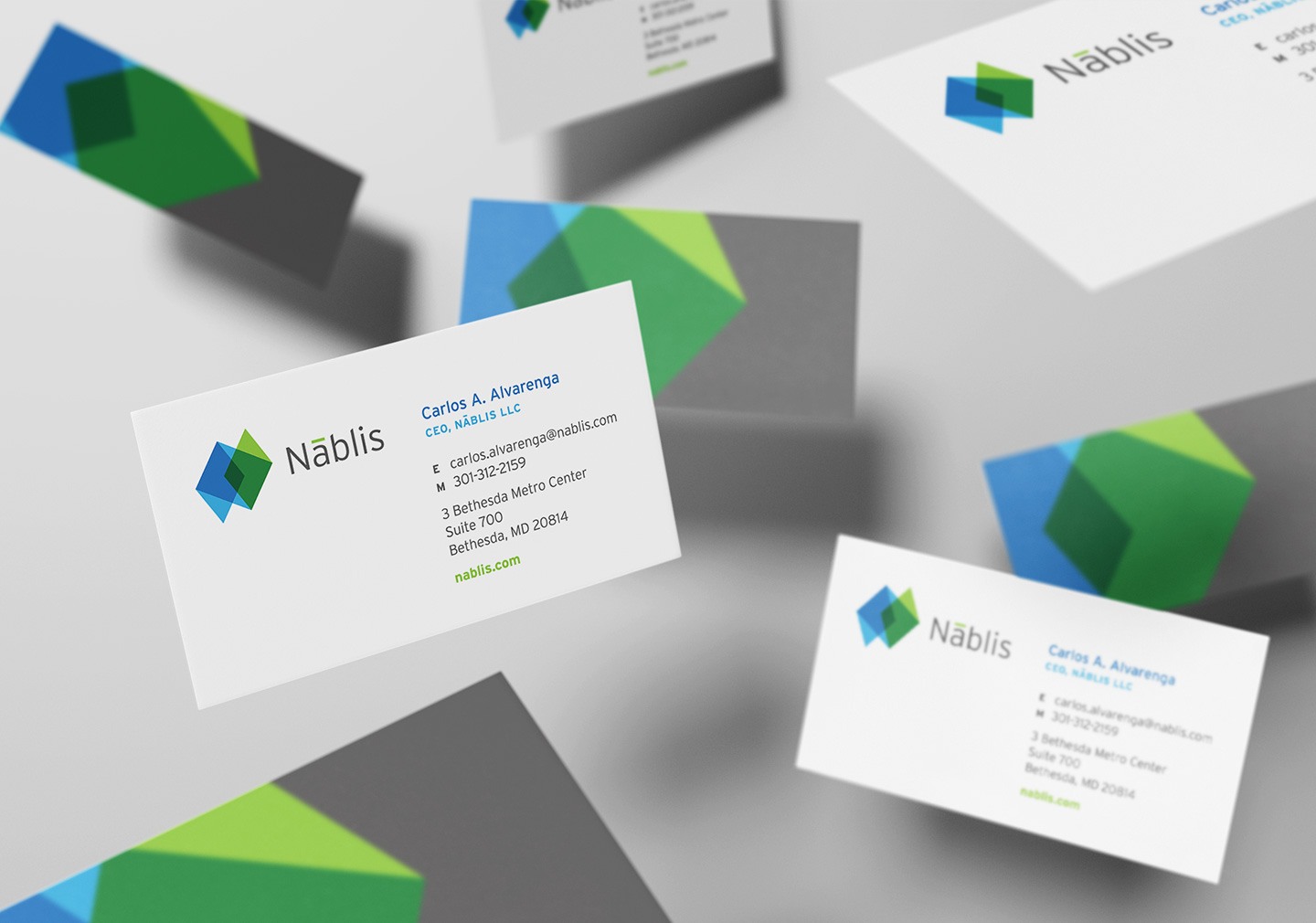
 Figure 3. Nablis’ logo applied to business cards.
Website – Apart from your logo, your website is probably the most visible expression of your brand identity. It is a rich visual medium that can include motion graphics, engaging user interactivity and multimedia elements — so it offers a terrific opportunity to impress your audience. It is also a complex platform that must look great on devices large and small. If it is not designed and built with skill, a lot can go wrong.
Let’s be honest. Websites are expensive, and great websites can be very expensive. But because virtually every prospect will check out your website, it is one of the most important brand design investments you can make. According to our research, about a third of professional services buyers reject a firm on the basis of its website alone. So be sure to put your marketing budget where your buyers are.

Figure 4. Grimm + Parker Architects’ website is visually dynamic.
Marketing Collateral – This is a general term for any outward-facing printed or digital materials that you might supply to a prospective client or job candidate. In these materials — whether a firm brochure, sales sheets or research report — you can explore the full range of your visual brand. From colors and photography to typography and layout, collateral is where designers can strut their stuff and push the creativity of your brand identity.

Figure 5. EDG2’s firm brochure casts the firm as sophisticated and energetic.
Stationery – In today’s electronic business environment where PDFs, Word docs and email have replaced couriers, snail mail and overnight delivery services, there is less and less need for traditional printed letterhead and envelopes. In fact, some firms have abandoned the paper versions entirely. And while business cards are still common, they are no longer essential equipment at some businesses. Whether or not you have embraced the all-digital workplace, you still need to make a good impression at every touch point with a prospect. Every time you send a letter electronically or on paper, and whenever you hand a prospect your business card, you are delivering visual signals about your credibility and professionalism. High-credibility firms are associated with crisp, elegant design, and making the right impression is especially important on these early-stage, front-line materials.

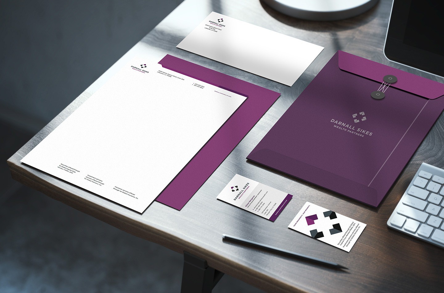
Figure 6. Darnall Sykes Wealth Partners’ stationery suite is rich and confident — exactly what a wealth management firm should be.
Other Elements – Of course, a firm’s visual design can be applied to anything people outside or inside the firm might encounter. Here are a few examples:
- Tradeshow displays
- Advertising
- Social media pages
- Proposals
- Pitch decks
- Deliverables
- Environmental signage
- Vehicles
- Uniforms
It’s important that all of your marketing components communicate the qualities and personality of your brand with consistency.

Figure 7. S&ME vehicle and uniform branding.
Brand Identity Guidelines – How do you corral your designers and far-flung team of professionals to maintain a visually organized and strategically sound visual identity? Brand identity guidelines are an important part of the answer. (Another, often more challenging part is enforcing the guidelines.) Ask your branding firm to document your identity’s key elements and their usage. Basic guidelines might cover a few key items: your logo, color palette and typography, for instance. A more comprehensive document might include guidance on layout, photography, signage, video, animations and even your writing tone and voice.

Figure 8. RS&H’s brand style guidelines.
What Separates Great Visual Brand Design from the Ordinary?
Great design. It’s tough to define, but you know it when you see.
Or do you?
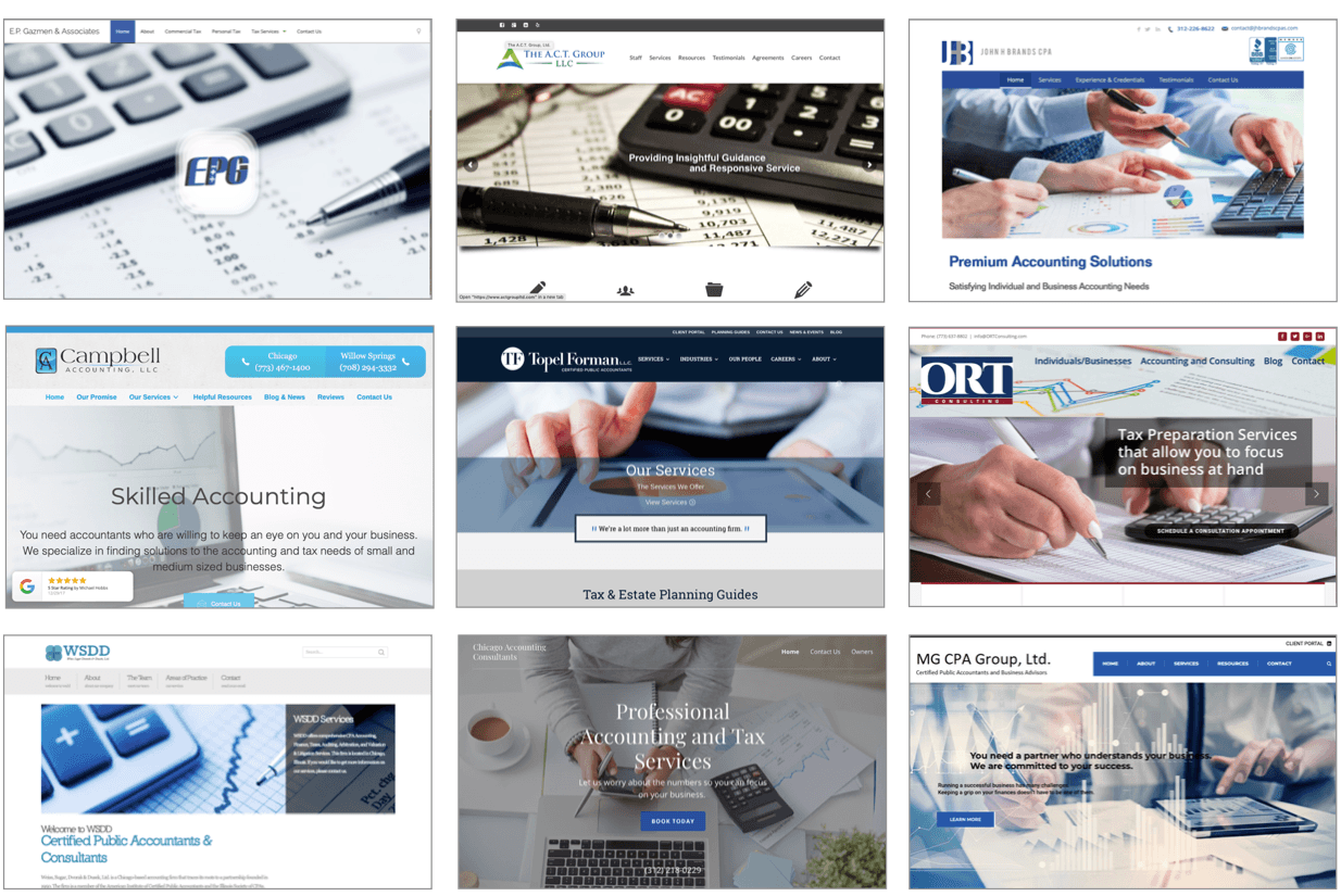
Why is it, then, that so many firms take similar approaches to their brand identities? Let me illustrate my point. Here are the homepages of nine Chicago accounting firms:

Notice any problems here?
For one thing, all of these homepages are dominated by the color blue, which happens to be the most common color across the professional services. Firms seem to gravitate to “navy” and “royal” blues, in particular. When so many competitors share the same narrow preference for colors, buyers are conditioned from the beginning to believe that their choices are all alike.
Download The Brand Building Guide
Another endemic problem is clichéd imagery. These home pages feature the same predictable, tired images, following a familiar, well-worn road. Calculators, pens, charts, computers — these images not only represent a failure of imagination, they compound the buyer’s dilemma. In your industry, the clichés might be chess pieces, boardrooms, mountain climbers, handshakes, eagles, gavels, globes, puzzle pieces, stethoscopes — the list of stale imagery is as exhaustive as it is exhausting. Do any of these look-alike firms bring anything special to the table? The answer, regrettably, is probably not. And if they do, they sure don’t act like it.
Brand design is an opportunity to break out of the follower mentality and take your brand design in a fresh direction. If most of your competitors have followed a particular visual direction, then take that as your cue — head somewhere else. Almost anywhere else is better than the miasmic mud holes where the herds wallow.
Of course, not all of your competitors use the color blue. Nor do they all embrace the same types of imagery and layouts. That’s why — before you begin redesigning your identity — you need to find out what your competitors are doing visually. Conduct a formal survey of their visual brands. Can you spot any trends? Then work with your branding partner to explore the open territory where you can differentiate you firm and give your brand room to grow.

Figure 10. Don’t be afraid to take your brand in a fresh, new visual direction.
Great visual brand design is as much about finding your own way as it is about typefaces and colors and grids. When you work with a branding firm or graphic designer, it’s important that you appreciate this concept — encourage your design partner to explore the blue ocean and take some risks. It’s far too easy to settle for a brand design approach that is comfortable and safe. And by “safe,” I mean terriblefor your business.
Now, to explain in this blog post what makes one logo or website design good and another ho-hum is an almost impossible task. Good taste is acquired over time through repeated exposure to exceptional design. An experienced visual brand design partner can navigate the opportunities available to you and help you create an identity that evokes credibility, sophistication and vitality. Here some things to look for in a brand design partner:
- They know your industry.
- They’ve worked with brands that you admire.
- They use research and data to inform their creative decisions.
- They win design awards. (While you shouldn’t take awards too seriously, they can be a signal that a firm produces distinguished, original work.)
- They have the confidence to lead you through the rebranding process and explain their recommendations when you have questions.
And to take that last point one step further, it’s up to you to give your branding partner the permission to take your firm into uncharted territory.
Conclusion
Brand design at its best should challenge you at every turn. A strategy that truly differentiates your firm demands sacrifice — often pruning away client segments or service offerings you’ve grown comfortable with over the years. And a well-conceived brand identity should go out of its way to thumb its nose at the status quo. That’s not to say every great brand design has to be brash or bold. But it should have a personality all its own and a purpose that is clear, easy to grasp and distinctive.
In the end, brand design should not be driven by you, at all — it’s the buyer who matters most. Brand design is about making it easy for the buyer to make the right choice in the marketplace. It’s about positioning your firm to be the clear pick and making sure that appropriate prospective clients not only can find your firm but are predisposed to trust it.